
From Bold Orange to Refined Resort: How 1609 Marketing Rebranded the Riviera RV Resort. A deep dive into the strategic logo redesign and brand identity transformation of one of Lake of the Ozarks’ premier RV resort destinations.
Transformation at a glance
A Resort Brand That Needed to Evolve
When the Riviera RV Resort at Lake of the Ozarks approached 1609 Marketing for a brand refresh, the brief was clear: the property had grown into one of the region’s most sought-after camping and resort destinations, but the logo hadn’t kept pace. The original mark — a bold orange square featuring a white palm tree above the words “Riviera RV Resort” and “Riviera Villas” — was functional, but it didn’t tell the full story of where the resort had arrived as a brand. The new owners of the resort decided the brand needed a refresh.
What followed was a thoughtful, top-to-bottom brand identity redesign that touched the logo, color system, typography, and visual hierarchy. The result is a mark that feels premium, place-specific, and built for the next chapter of the resort’s growth.
A great logo isn’t just a pretty picture — it’s a strategic asset that communicates who you are, who you serve, and why you’re different.
Deconstructing the Old Logo: What It Said (and Didn’t Say)
The original Riviera RV Resort logo had some genuine strengths. The bright orange was attention-grabbing, the square format was versatile, and the clean white serif typography was readable at a glance. But when you look at it through the lens of modern brand identity design, several challenges emerge:
| ELEMENT | OLD LOGO | THE PROBLEM |
|---|---|---|
| Color | Orange + White | Orange reads as energetic and approachable, but can skew fast-casual rather than resort-quality. It also bears no relationship to the lake environment. |
| Icon | Generic Palm Tree | Palm trees are synonymous with tropical beach destinations — not the Ozarks. The icon didn’t build a sense of place or distinctiveness. |
| Typography | Block Serif, All Caps | Legible, but common. Every element competed equally for attention, creating visual noise rather than clear hierarchy. |
| Brand Story | Minimal | Nothing in the original mark communicated hospitality, outdoor adventure, lakefront living, or the pineapple-meets-Ozarks personality the resort had cultivated. |
In short: the old logo worked as a sign. The new one works as a brand.
The New Brand Identity: Every Choice Is Intentional
The new Riviera logo — developed in both a primary horizontal format and a circular badge lockup — is a masterclass in purposeful logo design. Here’s a breakdown of the key decisions 1609 Marketing made and why they matter.
The Pineapple: More Than a Pretty Icon
The centerpiece of the new logo is a beautifully illustrated pineapple, positioned so that it sits inside the open space of the letter “I” in “RIVIERA,” integrating seamlessly into the wordmark. The pineapple is a universally recognized symbol of hospitality and welcome — a centuries-old tradition that signals warmth, generosity, and a host’s commitment to their guests. For an RV resort that prides itself on exceptional hospitality, the symbolism is perfect.
But the pineapple also carries modern lifestyle connotations. It’s become a visual shorthand for resort culture, warm-weather living, and a certain elevated-casual aesthetic that resonates powerfully with today’s camping and glamping audience. It’s the kind of icon that works equally well on a welcome sign, a branded hat, a social media post, or an email header.
The Color Palette: A Return to Peace
Perhaps the most dramatic shift in the rebrand is the color palette. Gone is the generic orange. In its place: a sophisticated system built around three anchoring hues.
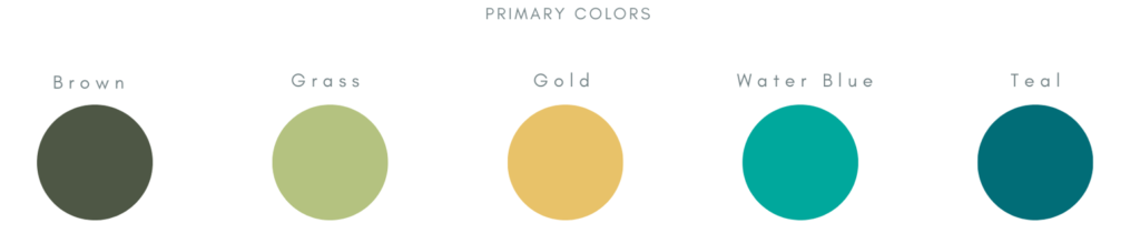
Dark Olive Green: Used for the primary wordmark typography. Grounded, natural, and evocative of the forested Ozark hillsides that surround the lake. It communicates longevity, trust, and outdoor authenticity.
Warm Gold / Amber: The body of the pineapple. This warm, sun-drenched hue ties the mark back to resort leisure — sunshine, summer, and the golden hours on the water. It also provides strong visual contrast against the olive green.
Teal / Aquamarine: The waterscape element at the base of the logo. This is Lake of the Ozarks itself — rendered in a fluid, organic shape that evokes the lake’s irregular, sprawling shoreline. It anchors the logo in a specific place.
This isn’t just an attractive color palette. It’s a narrative palette — telling the story of the resort’s environment, hospitality, and character in three colors.
The Waterscape: Branding With a Sense of Place
One of the most distinctive elements of the new logo is the abstract lake waterscape that flows beneath the “RIVIERA” wordmark. Rather than a generic wave or water symbol, the design reflects the actual character of Lake of the Ozarks. The organic, flowing water shape feels alive and site-specific in a way that no stock icon could replicate.
Typography: Hierarchy That Guides the Eye
The new wordmark uses a refined serif typeface with elegant weight variation — letters that feel substantial without feeling heavy. The name “RIVIERA” dominates at large scale, with “RV RESORT” and “LAKE OF THE OZARKS” in spaced, lighter tracking that creates a clear three-tier hierarchy. Your eye lands on RIVIERA first, understands the location context second, and completes the story with RV RESORT.
This kind of typographic hierarchy in logo design is a hallmark of professional brand identity work. It ensures the logo reads correctly at any size — from a 2-inch card to a 20-foot billboard.
Why a Strategic Rebrand Matters for Hospitality Businesses
Some business owners wonder whether investing in a professional rebrand is worth it. For a hospitality property like an RV resort, the return on a strong brand identity compounds over time in ways that are genuinely measurable.
A well-designed logo signals quality before a guest ever arrives. It creates trust where first impressions happen in milliseconds. And it builds brand recognition. It also provides a cohesive visual foundation for every future marketing effort — from social media campaigns to billboard signage.
The Riviera rebrand specifically positions the resort to compete in a growing outdoor hospitality market that has become increasingly sophisticated. Today’s RV traveler has high expectations for the properties they choose. A brand that looks like it belongs in that conversation starts every interaction with an advantage.
Key Takeaways for Anyone Considering a Logo Redesign
Whether you’re a resort owner, a small business, or a regional brand thinking about a refresh, the Riviera RV Resort rebrand offers several lessons worth studying:
- Icons should earn their place. The pineapple isn’t decorative — it carries a specific, resonant meaning that aligns perfectly with the brand’s values.
- Color is strategy, not just aesthetics. Each hue in the new palette does communicative work: place, hospitality, and season.
- Design for versatility from day one. A primary lockup and a badge mark give the brand flexibility across every touchpoint.
- Typography hierarchy is a navigation system. Guiding the viewer’s eye through a logo is as important as how the logo looks.
- The best logos tell a story about a specific place or specific brand. Generic is forgettable. Specific is memorable.
About 1609 Marketing
1609 Marketing is a full-service marketing agency that partners with businesses of all shapes and sizes — from hospitality and travel to healthcare, dental, financial services, legal, and beyond. No matter your industry, if you have a brand worth building, we’re here to help you build it right.
We know that every business is different, and we take the time to understand yours before we ever open a design file or write a single line of copy. Our team brings together strategy, creativity, and a genuine passion for helping clients grow — and we like to think that comes through in everything we make.
Our services include:
- Brand Identity & Logo Design: From first-time brands to full rebrands, we create visual identities that make lasting impressions.
- Website Design & Development: Beautiful, fast, and built to convert — websites that work as hard as you do.
- Social Media Management: Consistent, on-brand content that keeps your audience engaged and your business top of mind.
- Digital Advertising (PPC & Paid Social): Smart, targeted campaigns that put your brand in front of the right people at the right time.
- Local SEO: We help your business show up where it matters most — in local search results when nearby customers are looking for exactly what you offer.
- Photography & Video Production: High-quality visual content that tells your story and stops the scroll.
- Print & Collateral Design: Business cards, brochures, signage, and more — designed with the same care as everything else we touch.
Whether you’re a boutique RV resort on the lake, a dental practice looking to grow, a law firm ready to modernize, or a travel brand chasing bigger reach — 1609 Marketing is the team that shows up ready to do the work.
Ready to talk about what your brand could become? Let’s get started.